Accessibility vs usability: where people get it wrong

Accessibility and usability are often used interchangeably.
They shouldn’t be.
They overlap.
They support each other.
But they are not the same thing.
And misunderstanding that difference is where many teams go wrong.
The Simple Difference
Let’s strip it down.
- Accessibility asks: Can people use this at all?
- Usability asks: How easy and efficient is it to use?
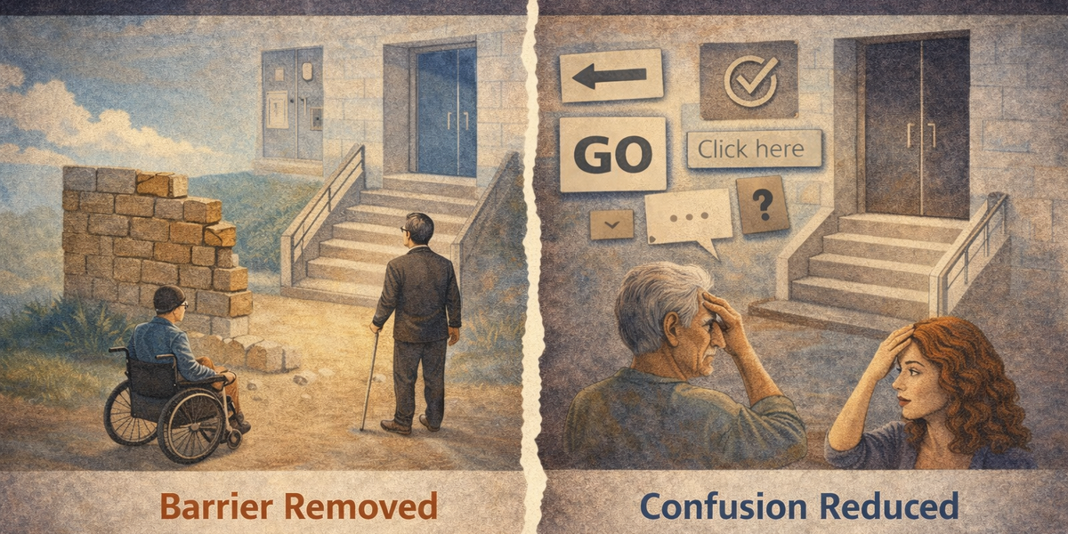
Accessibility is about removing barriers.
Usability is about reducing friction.
You can have one without the other - and that’s where problems start.
When Something Is Usable but Not Accessible
This is surprisingly common.
A website may:
- Look clean
- Feel intuitive
- Have a simple checkout flow
- Score highly in user testing
But:
- It can’t be navigated by keyboard
- Text contrast is too low
- Screen readers don’t announce labels properly
- Focus order is unpredictable
For most users, it feels “easy.”
For others, it’s completely unusable.
From the team’s perspective, usability testing passed.
From a portion of users’ perspective, the product fails at step one.
That’s not a usability problem.
That’s an accessibility barrier.
When Something Is Accessible but Not Usable
This is less talked about - but just as real.
A site may technically:
- Support keyboard navigation
- Pass contrast ratios
- Provide alt text
- Expose proper ARIA roles
But:
- The layout is cluttered
- The navigation is confusing
- The forms are overwhelming
- The instructions are unclear
Everything works.
But it’s exhausting.
You’ve removed barriers - but you haven’t made the experience smooth.
Accessibility compliance does not automatically create good usability.
Where People Get It Wrong
The confusion usually shows up in three ways.
1. Treating Accessibility as a Subset of Usability
Some teams assume:
“If our product is usable, it must be accessible.”
That’s backwards.
Accessibility is a foundation.
Usability builds on top of it.
If someone can’t operate your interface at all, usability improvements are irrelevant.
2. Treating Accessibility as a Checklist
Other teams swing in the opposite direction:
“If we pass accessibility guidelines, we’re done.”
Accessibility guidelines ensure minimum operability.
They don’t guarantee clarity, simplicity, or efficiency.
You can pass tests and still frustrate users.
3. Assuming Accessibility Only Affects a Small Group
Accessibility is often framed as something that benefits “a small minority.”
Usability is seen as something that benefits “everyone.”
In reality:
- Keyboard support improves efficiency for power users.
- Clear focus states improve navigation for all.
- Proper structure helps scanning and comprehension.
- Good contrast improves readability in bright environments.
- Predictable patterns reduce cognitive load.
Accessible design frequently improves usability for everyone — not just a specific group.
A Practical Example
Imagine a modal dialog.
Accessibility requires:
- It traps focus correctly
- It has a clear accessible name
- It closes via keyboard
- Screen readers are informed of its presence
Without those, some users cannot interact with it at all.
Usability requires:
- It doesn’t appear unexpectedly
- It doesn’t interrupt tasks unnecessarily
- Its content is concise
- Its action buttons are clear
Without those, everyone gets annoyed.
You need both.
Why This Matters in Real Projects
If you treat accessibility and usability as the same thing, you risk:
- Missing hidden barriers
- Over-relying on surface-level testing
- Declaring success too early
If you treat them as separate but unrelated, you risk:
- Designing accessible but frustrating systems
- Creating technically compliant but confusing interfaces
The healthy view is this:
Accessibility ensures inclusion.
Usability ensures comfort.
The Better Way to Think About It
Instead of asking:
“Is this accessible?”
Or:
“Is this usable?”
Ask:
- Can someone use this without a mouse?
- Can someone with low vision read this comfortably?
- Can someone complete this task quickly and confidently?
- Does the structure make sense when read aloud?
- Is the interaction predictable?
Accessibility and usability aren’t competing priorities.
They are layers of the same goal:
Build interfaces that work for real people under real conditions.
Final Thought
A product that is usable but not accessible excludes people.
A product that is accessible but not usable frustrates people.
The best products are both.
And getting that balance right doesn’t require perfection.
It requires awareness.
Because most teams don’t intentionally ignore accessibility or usability.
They just assume one covers the other.
It doesn’t.